ShopDreamUp AI ArtDreamUp

Deviation Actions


Suggested Deviants


Suggested Collections


Description
I'm not very good at artsplaining stuff but here goes.
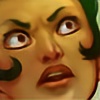
1. ugly-ass rough sketch lol
2. second cleanup sketch, sometimes I will even do 3 layers of sketch before cleanup. thought a whole tardis would be better, expanded the canvas
3. cleanup, what I like to do instead of inking usually, helps define the forms better, digital inking makes my hand cramp up so I try to avoid it. Just forms, no values except for a bit in the hair so the texture is defined more.
4. shadows are black and painted on a layer above the drawing, the layer is faded to about 40% to test what degree of depth I want. Attacked sketch of tardis with the line tool in photoshop, done on a layer behind the people, and a flat gray opaque layer sandwiched between. Flat colors will go on that layer.
5. highlights on a new layer as well, 100% white so I can see exactly what I'm doing, its always easier to fade things than the other way around. Reset shadow layer to full opacity (well, maybe 80-90% or so)
6. flats. the moon is on its own layer w/ a few glow layer effects. not true "flats" on the tardis, it was colored with gradients.
7. this is what the flats look like with the shadow and highlight layers on top, shadows have normal blending mode, highlights have overlay. Spend some time messing with the opacity until I get a level of contrast that I like.
8. Added in starscape and glowing light fractals, woodgrain textures on tardis, used about 3 layers of different moon photos to get the texture. A couple of masked adjustment layers were used to make the blue "fog", one brightness/contrast and one hue/saturation.
9. This possibly the longest most annoying but also most significant step. Assumptions were made that I was finished at step 8. NEVER! Always cram in as much color as possible, that's my personal rule, because my favorite color is *~rainbow~*.
Locked the transparency on the drawing, shadow, and highlight layers, and started coloring. a LOT. 90% of the work went into coloring the drawing layer, this is where the minor shading plays a role, its basically like coloring in outlines, but with extra bits... skintone shading was purplish, red (around ears and noses), pink, most of the outlines are PURPLE and MAGENTA and a bit of dark blue, very very rarely black. The basic shadow layer is just flat purple, normal blending mode. I meant to do more with it but once I made it purple I liked it that way. Didn't really do anything to the highlight layer, but I did add some blurry circle gradients on the faces (also a seperate layer) The doctor's brainyspecs are also on a completely different layer btw. Billions of layers in this argh
This is a really really awesome way to color IMO because it makes it really easy to keep tweaking and nitpicking at it since the flats are still on a seperate layer... did random things like make jack's coat darker and fiddled with haircolors and skintones.
Since it seems probable that I'll never get around to making any proper tutorials *cough* feel free to ask questions and I will answer them to the best of my ability :>
I made a gif but it's only downloadable. blergh. So now I am uploading an annoyingly long jpg instead! Click for fullview
Image size
294x4736px 399.73 KB
© 2009 - 2024 questionstar
Comments44
Join the community to add your comment. Already a deviant? Log In
I know this is really old, but I still got to ask. >_>
I have tried to use a similar "start with b/w and then color on a color-blended layer"-technique before, but my results always get really dull. Any tip at making it more vibrant? Could the issue be that I use too few tones?
I have tried to use a similar "start with b/w and then color on a color-blended layer"-technique before, but my results always get really dull. Any tip at making it more vibrant? Could the issue be that I use too few tones?